Part 1
Name: Rutger Zuydervelt
Nationality: Dutch
Occupation: Graphic Designer, Producer
Recommendations:
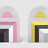
Susan Stenger ‘Sound Strata of Coastal Northumberland’ installation / book+cd. [For more information on the project, click here]
A beautifully realised project, and such a great, simple, effective idea. Stengen found a cross-section drawing of coastal geological formations from the River Tyne to the Scottish border, dating 1838. She used it as a graphic score, incorporating traditional music and instruments from the aerias the river runs through. I haven’t seen the installation version, but the book (with the complete drawing) + cd is fantastic (too).
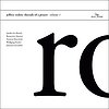
Robin Hayward ‘States of Rushing’ cd/lp
I can’t find a good image online of the whole packaging, but this design is just incredible. It’s just this beautifully composed photo that is the cover. The player (face hidden) and the trombone (shape obscured) become this almost abstract but very precise contour… it fits the music really well and its an astonishing image on itself. The typography and layout of the rest of the sleeve are just as minimal and beautiful. Very refined. For me, this is a recent classic.
Contact/Website: To get in touch with Rutger Zuydervelt, visit his website. We also did a Machinefabriek interview on his music production work.
When did you start creating designs and layouts for music - and what or who were your early passions and influences? What what is about the relationship between music and design that drew you to it?
I was always into music, so when I was studying graphic design at the art academy in Arnhem (The Netherlands), the designers I looked up at the most, were doing record sleeves. Peter Saville was probably the most influential to me, and I really liked Designer’s Republic.
Besides the fact that working on a graphic design or a piece of music are very similar processes, the relation was already there ‘cause I’ve been making music since high school. And I started self-publishing tapes and after that CDr’s. These releases needed sleeves, of course, so I could combine both my passions.
For most artists, originality is first preceded by a phase of learning and, often, emulating others. What was this like for you? How would you describe your own development as an artist and the transition towards your own voice? What is the the relationship between copying, learning and your own creativity?
To be honest, I never really worked towards ‘finding my own voice’ … I’m possibly still copying things nowadays. Not consciously, but I’m pretty sure you can still see from my designs that I love Saville, Meeuw and Kim Hiorthøy’s designs.
Also, when I see things that I’ve made 5 or 10 years ago, I think to myself ‘I might not have done this any different nowadays’. So maybe I found ‘my voice’ really early, or my style just stagnated… I've even been working on the same computer for more than 8 years now …
I knew early on that I like my (and others’) design to be free of clutter. Simple but not simplistic. Maybe a tiny bit less dry than pure Swiss design though…
What makes for a great music related design? What are the differences in terms of approach for different formats like posters, flyers and covers?
It’s so hard to say what makes a great design great … For a big part it’s obviously about taste, so that hard to argue about. But my favourite covers have some sort of clarity about them. It doesn’t necessarily have to be super minimalistic, it’s actually great to have lots of details in it, as long as it doesn’t become a mess.
A poster should stand-out immediately of course, when it’s used for promo stuff. Just one clear message that’s immediately clear. But an album design can be way more detailed, cause people will pick it up, hold it in their hands, discover things …
I always hated it when an LP version of an album would have the exact same cover design as the CD … that they didn’t even bother to change the font-size or anything! Or make actual use of the bigger size, image-wise also.
What kind of relationship is there between the cover of a release and the music? What can the visual layer add to the music or how can it even change its impact? Would you say the end result is an art work in its own right, a fusion or merely a support of the music?
Of course a beautiful album cover can be ‘enjoyed’ in its own right, but you should still mainly see it as a fusion with the music. Ideally; if you like the sleeve, you should like the music. In a way, it has to be a representation of it, but it should also not give everything away …
I used to listen to a lot of death metal in the 90s, and I really loved some of the album sleeves, and the crazy logos. For me, these albums are extremely connected to their sleeves. Both are just as iconic. It’s a really intense marriage of sound and visuals. Not sure if my designs get to that level, but if so, that would be great …
How do you make use of technology? In terms of the feedback mechanism between technology and creativity, what do humans excel at, what do machines excel at?
The computer is just a tool to me. A completely unmissable tool that is. I really don’t do anything high-tech with it, it’s basically the same as cutting and pasting with scissors and glue, but made so much easier. In this respect, the machine excels at creating an environment to make the designer’s work fluent, and to make it able for him/her to try different things really quickly. For me, the machine makes sure this whole process becomes really organic and ideas can be tried out quickly.
Collaborations can take on many forms. What role do they play in your approach and what are your preferred ways of engaging with the artists you're working for?
Sometimes I get ‘carte blanche’, sometimes I get an image that’s to be used on the cover, and some guiding lines. I like both. Being completely free sometimes results in making things that the client doesn’t like, and then I’ll keep working on it until both of us are happy. There have been some more frustrating moments, but most of the time, we’re on the same wave length pretty quickly.
It’s easier when there’s already a cover image supplied, but I still love doing that … There’s nothing more satisfying than playing around with image and text until the balance is right. Working on a design, and coming to a point where everything is in it’s right place, that very fulfilling.


